 GoWebinars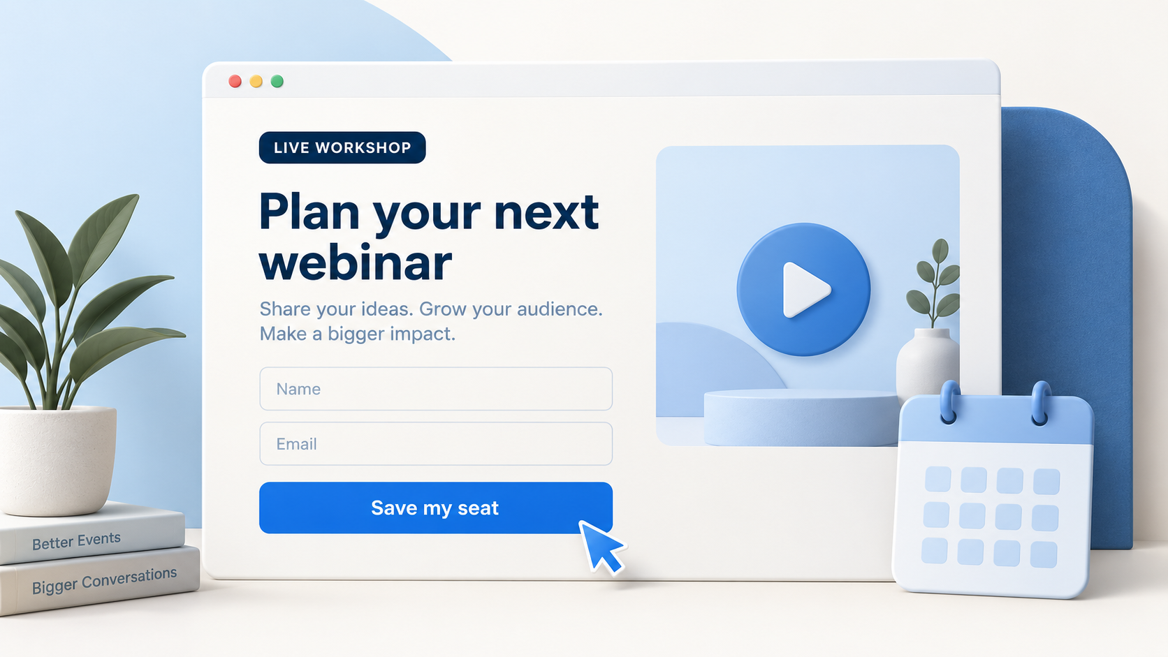
You get someone to click your ad. They land on your webinar page. Now they have one decision to make: is this worth signing up for? Your page should help them answer that quickly. A beautiful design helps, but the real work is making the webinar relevant, believable, and easy to register for.
Make the promise clear, match the traffic coming in, and remove unnecessary friction. Then judge your changes by the people who register and show up—not just by how the page looks.
Find the bottleneck before redesigning
An expensive registration does not automatically mean your page is bad. Look at the journey leading to it: what you paid to reach people, how many clicked, how many actually loaded the page, and how many completed the form. Each step points to a different place to investigate.
If people see the ad but rarely click, start with its audience and message. If clicks arrive but page visits do not, check loading and tracking. If visits arrive but registrations do not, review the page, the promise, and whether the ad brought the right people. A healthy click-through rate alone does not prove the traffic is qualified.
Calculate your registration rate using completed registrations divided by measured page visits. For example, 100 registrations from 500 visits is 20%. That is a calculation, not a universal target. Cold traffic, an existing audience, the topic, and the commitment you ask for can all change what a useful baseline looks like.
Compare like with like. Separate your email audience from paid traffic where you can, and use the same measurement method across tests. Otherwise, a change in audience can look like a change in page performance.
Give the page one clear job
A registration page does not need to explain your entire business. It needs to make the right person want to attend this particular webinar. Start with a clear headline, a short explanation, the event details, and a straightforward form.
Make the date, time, and time zone easy to find. If the session is on demand, say so. Add a brief speaker introduction or relevant proof when it helps someone decide. These are useful details; a long company story usually is not the first thing someone needs.
Keep the first screen focused on the decision. Additional sections should answer real questions: who is this for, what will I learn, and why should I trust the person teaching it? Give each extra element a reason to be there.
Tell people what they will learn
Start with the audience and the outcome of attending. “Unlock your potential” could describe almost anything. “Build your first webinar follow-up plan” tells someone what the session is about and gives them a reason to keep reading.
Use the subheadline to make that outcome concrete. For example: “A practical workshop for coaches: map your reminder emails, replay message, and first sales follow-up before your next webinar.” Now the visitor knows who it is for and what the session covers.
Specific does not mean making a bigger promise than you can deliver. Avoid guaranteed revenue claims or dramatic timelines just to get the click. A clear, useful learning outcome gives you something you can actually deliver on.
Read the headline and subheadline together. If they repeat each other, use the second line to explain the approach, answer an obvious question, or make the audience clearer.
Make the page match the invitation
The registration page should feel like the next sentence of your ad or email. If the ad promises a workshop on getting more people to attend, a page about building an entire business creates a gap—even if both topics interest the same audience.
Carry the same central promise into the headline, supporting copy, and visual. You do not need identical sentences everywhere. You need the visitor to recognize the session they clicked for.
When you run different angles, consider matching the page to each one. A reminder-focused ad and a replay-focused ad may need different introductions to the same workshop. Keep every version accurate to what the webinar will teach.
Use a visual that earns its space
A useful image can show the speaker, the framework being taught, or a relevant example. It should make the session easier to understand. A decorative dashboard with unrelated numbers does not help someone decide whether to attend.
A video is an option, not a requirement. If you use one, let it quickly explain the session and why it is useful. Do not make people watch a long pitch before they can find the form or understand the offer.
Test whether the visual helps your audience. A static image, a short preview, or a simpler page without either may work best in your situation. If an image has a play button, it should play something; registration should remain a clearly labelled action.
Ask for information you will use
Start with the details you need to deliver the webinar experience. An email address lets you send access information; a name can make the experience more personal. Every additional field should serve a clear purpose.
A phone number may matter if your process includes reminders or a conversation with a setter. Explain why you are asking, distinguish required details from optional ones, and do not treat a webinar signup as blanket permission for every kind of follow-up.
The same applies to qualifying questions. If a question changes how you prepare, segment, or follow up, it may be worth asking. If nobody will use the answer, remove it. When testing a shorter form, look at lead quality as well as the registration rate.
Use a single-column form with visible labels, helpful error messages, and a clear button. “Save my seat” explains the action more directly than “Submit.” Place it where someone can comfortably tap it on a phone, and avoid surrounding it with competing calls to action.
Build your webinar follow-up plan.
Reminders, replay, and the next conversation.
Build trust without adding pressure
Use proof that is relevant to the session: the speaker’s experience, a specific attendee comment, or an example of what will be taught. A wall of unrelated logos can take up space without answering the visitor’s actual question.
Let genuine event details do the work of urgency. A live session has a real start time. A registration deadline can be useful when it is actually enforced. Only describe seats as limited when there is a real capacity limit.
Be clear about what happens after signup. Will they receive an email with access details? Is there a confirmation page? Knowing the next step can remove uncertainty without adding another persuasive paragraph.
Check the whole journey on your phone
Open the page on a real phone, ideally through the same ad or email link a visitor would use. Check headline wrapping, image size, form labels, keyboard behavior, and whether the button is easy to reach. A desktop preview is only part of the check.
Try an incomplete form and an invalid email, then make a test registration. Does the error explain how to fix it? Does a successful signup reach the right confirmation page? Does the promised access email arrive?
Compress oversized images and remove unnecessary embeds. Check the page on a slower connection too. The goal is a usable registration journey, not simply a page that looks good in the editor.
Test a clear idea, then follow the results
Start with a hypothesis you can explain: “Visitors do not know this workshop is for coaches, so we will name that audience in the headline.” That is more useful than changing the headline, image, fields, and button color at the same time.
Choose one primary change and keep the comparison fair. Track the number of visits and registrations, use comparable traffic, and give the test enough data before declaring a winner. A handful of extra registrations can be normal variation.
Then follow the people who signed up. Did they attend? Were they a fit for the offer? Did the follow-up lead to useful conversations? A page that attracts more low-fit registrations is not automatically the better page.
Before you send traffic, check five things: the promise is specific, the invitation and page agree, the form has a purpose, the mobile journey works, and the next step is clear. Get those right first. Then improve the page with evidence from your own audience.
You can use a GoWebinars page template as your starting point, or keep your existing website and use an embedded registration form. Either way, the principle is the same: make it easy for the right person to understand the session and reserve their place.